A brand guide can look excellent in a PDF while the website gradually drifts away from it. One editor makes a heading smaller to fit a line, another chooses a brighter button and a third copies a section from an old campaign. The problem is often that the approved choices are easier to describe than to use.
Bring the design rules into the editor
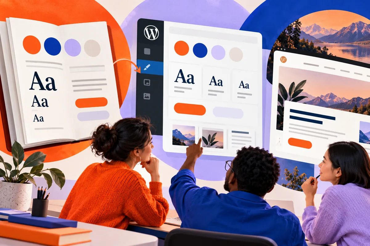
WordPress 6.8’s Style Book has a more structured layout and clearer labels. It also works with qualifying classic themes, as well as the block-theme workflow. That gives teams a practical place to inspect the website’s working styles instead of relying only on a separate design document.
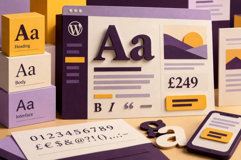
Use it to review the elements editors actually handle: headings, paragraphs, lists, buttons and image treatments. A style that appears only in a designer’s mock-up cannot guide a member of staff creating a page next month. The editor needs usable defaults.
Keep the number of choices deliberate
Consistency does not require every section to look identical. It requires a small set of choices with clear purposes. A main heading, a section heading and a compact label should be visibly distinct. A primary action should stand out without every link competing for attention.
Imagine a consultancy publishing event pages. Editors need enough flexibility for a short seminar and a detailed workshop. A few well-designed patterns and a controlled type scale can support both, while preserving the relationship between title, date, description and registration action.
Test with ordinary content
Preview long headings, short announcements, numbered lists and imperfectly cropped photographs. Use the words the team is likely to publish, rather than only polished sample text. This reveals whether the design system supports everyday work or depends on constant manual adjustment.
Check readable text sizes and contrast at the same time. A consistent collection of tiny labels is still hard to use. Brand character should come from thoughtful typography, spacing and colour relationships, not from making useful information harder to read.
Make consistency easier than improvisation
When editors repeatedly override a style, investigate why. Perhaps the standard heading is too large for common titles, or a useful layout is missing from the pattern library. Improving the underlying option is more sustainable than asking everyone to remember another exception.
A working Style Book can become a shared reference during design reviews and handovers. It connects the brand to the controls people use to maintain the site. That makes consistency an ordinary part of publishing, with less dependence on a designer correcting each page after it is written.