

A blog listing is often treated as the space where posts accumulate. For a visitor, it is a decision screen: which article is relevant, how current is it and what will they learn by opening it? The WordPress 5.8 beta brings the Query Loop and related template work into testing. That makes June a good time to review the listing as a useful part of the product rather than an automatic by-product of publishing.
Test the feature without promising the final release
The beta is development software and should be explored on a protected test site. Its value is to let the team try emerging editing capabilities with its own content and report problems. A beta feature list should not be read as a commitment that every existing theme or extension will behave correctly in a live deployment.
Start with a copy of the actual archive. A collection of demonstration posts with matching title lengths and perfect photographs can hide the problems a publishing team will encounter on its first ordinary week.
Give each card enough meaning
A useful article card needs a clear title and enough context to help someone choose. An excerpt should explain the question or subject, rather than repeat a clipped opening sentence that begins with generic scene-setting. Dates and topics can help a reader understand the collection, particularly when older material remains valuable but belongs to an earlier platform version.
Images should carry information rather than create a row of interchangeable technology decorations. If an article has no appropriate image, a considered text treatment can be more honest than forcing an unrelated photograph into the layout.
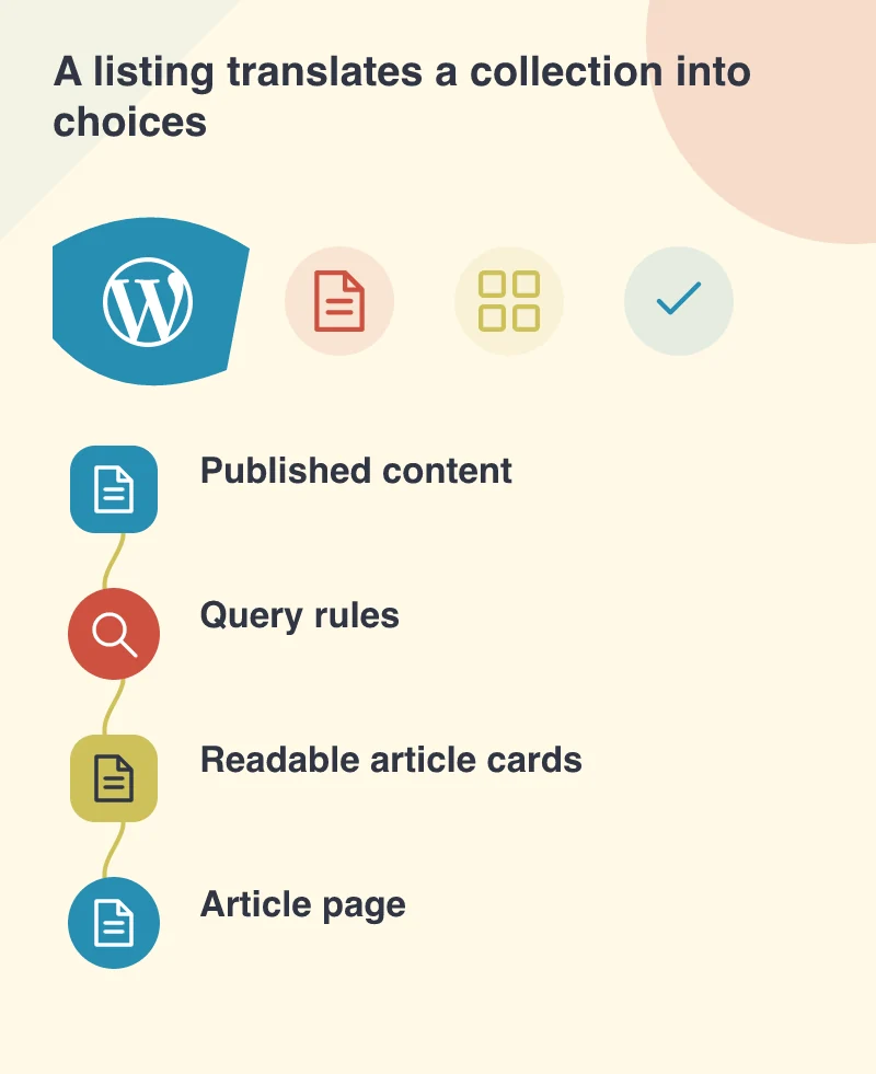
Decide what the query is meant to answer
Imagine a service business that publishes both customer guides and company updates. A page promising practical advice should not unexpectedly mix those categories without explanation. Define the content selection around the reader’s intention. Then test what appears when there are few matching posts, several pages of results or a newly published item.
The rules should also be understandable to the editor. If changing a category alters where an article appears, the handover should explain that relationship. Otherwise a flexible listing can become another invisible system that only its original developer knows how to control.
Review the route after the click
Open several cards and return to the listing. Check pagination, topic navigation and the distinction between the article title link and other nearby links. Test with a keyboard and on a phone. A visually neat grid is incomplete if the route through it is frustrating.
Put the listing’s selection rules beside its template. The publishing team should understand which articles appear, which information each card carries and where its link leads. That small agreement helps the archive remain useful as new content arrives.