

Approving a website on a large monitor can hide the version many people will actually use. From 1 July, mobile-first indexing is the default for new websites previously unknown to Google Search, as announced in May. This is a good moment to change the launch meeting itself. Start on a phone, with the content and tasks that matter, then use the larger screen to check the rest.
New means new to Google, not simply a fresh design
The announcement distinguishes previously unknown websites from older sites that continue to be evaluated for readiness. A redesign of an established domain is not automatically the same case as a newly discovered website. Use URL Inspection and the relevant Search Console information to understand the site being discussed. Do not infer its status from the age of the latest theme.
For either situation, essential content should remain equivalent across devices. Google’s guidance names text, images, video, links, structured data and other metadata. A mobile layout may organise those differently. It should not quietly remove the information a person needs to understand the business or compare a product.
Use a decision rather than a tour
Imagine someone considering an installation service while standing beside the equipment that needs work. Ask them to find the service area, understand what information is needed for a quotation and begin the enquiry. Time spent hunting for a hidden menu or pinching tiny text is relevant feedback. A presenter scrolling through screenshots cannot supply the same evidence.
Try the route with the phone keyboard open. Labels, validation messages and the submit control need to remain usable when the available space changes. Check a long name, an incomplete field and a file upload if the form requires one. These ordinary details can determine whether an interested visitor completes the task.
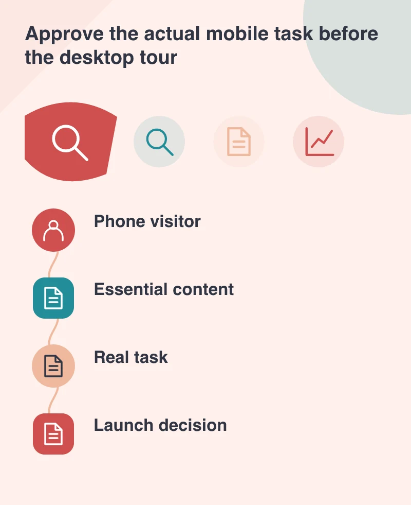
Keep one information structure where possible
Google continues to support several mobile-serving approaches but recommends responsive design and a single URL for new sites. That can simplify sharing and maintenance. The practical advantage is that an editor has fewer versions to keep consistent when a service detail changes.
Responsive does not mean every layout decision is solved. A wide comparison table needs a deliberate narrow-screen treatment. A large image needs appropriate delivery. A fixed header should not cover the heading a visitor follows. Ask the team to show the awkward content, not only the compact examples chosen for the design presentation.
End the meeting with observable acceptance
Record the URLs and tasks used for approval, including a representative service, an article and a contact route. Note unresolved content rather than replacing it with attractive placeholder text. The website should be approved for the information it will actually publish.
Search processing and customer use are different measures, but both benefit from a complete mobile page. Starting the review on a phone makes omissions difficult to overlook. It also gives an owner a more grounded way to judge the new design: can a person understand the offer and take the next sensible step in the screen they have?